Blend修改TreeViewItem样式

本文最后更新于 2025-11-16 22:11:25

Blend 修改TreeViewItem样式

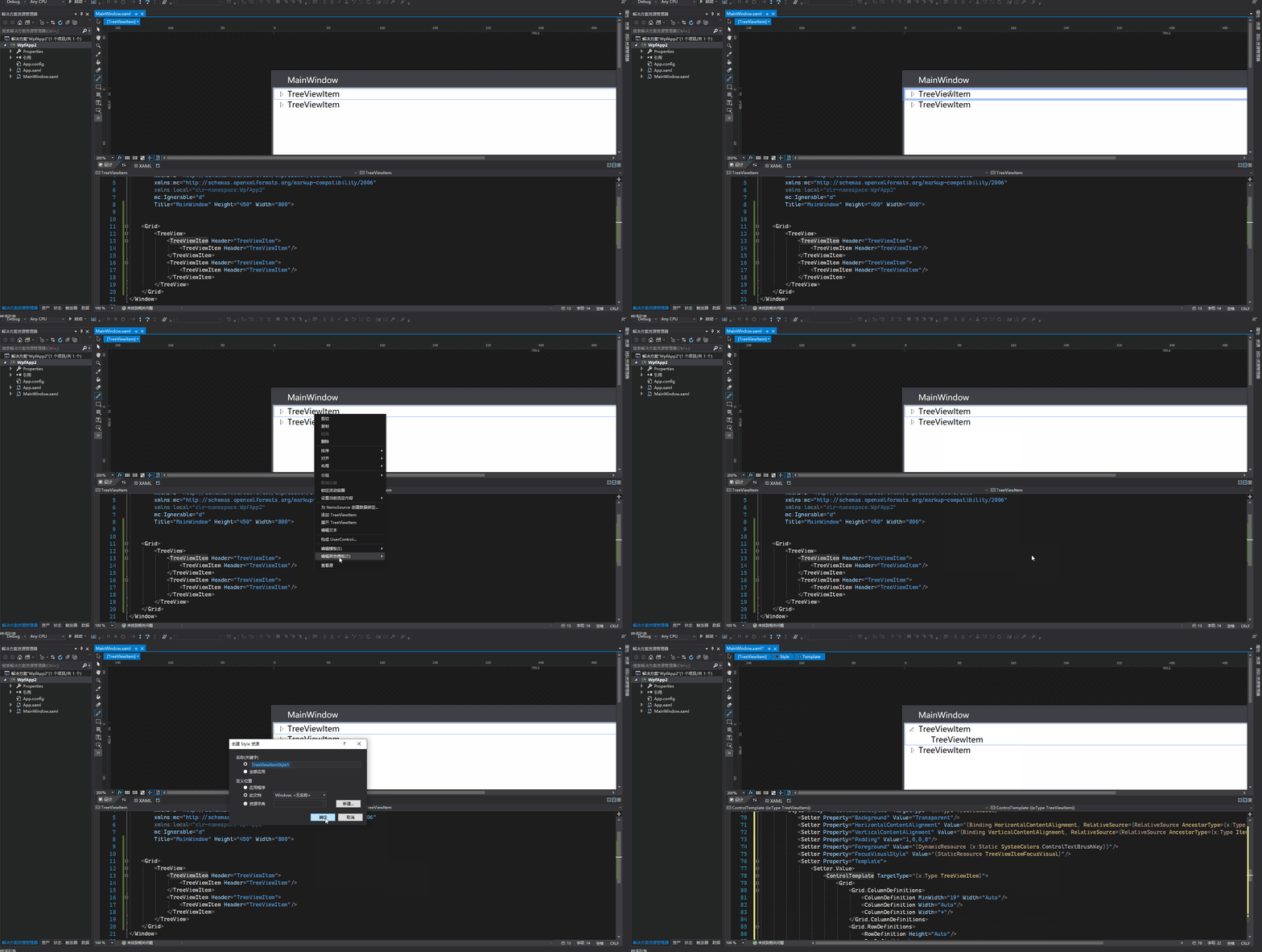
用Blend for Visual Studio 2019 新建Wpf项目,拖动一个TreeView控件到Grid上

1
2
3
4
5
6
7
8
9
10
<Grid>
<TreeView>
<TreeViewItem Header="TreeViewItem">
<TreeViewItem Header="TreeViewItem"/>
</TreeViewItem>
<TreeViewItem Header="TreeViewItem">
<TreeViewItem Header="TreeViewItem"/>
</TreeViewItem>
</TreeView>
</Grid>

在绘图窗口选中TreeViewItem,右键编辑模版->编辑副本

绘制水平、垂直虚线(参考博文

在TreeViewItem ControlTemplate模板中增加

1
2
3
4
5
6
7
8
9
10
11
12
13
14
15
16
17
18
19
20
<!-- Connecting Lines -->
<!-- Horizontal line -->
<Rectangle x:Name="HorLn"
Margin="10,0,0,0"
Height="1"
Stroke="#FF565656"
SnapsToDevicePixels="True"
StrokeDashCap="Square"
StrokeDashOffset="1"/>

<!-- Vertical line -->
<Rectangle x:Name="VerLn"
Width="1"
Stroke="#FF565656"
Margin="0,0,-2,0"
Grid.RowSpan="2"
SnapsToDevicePixels="true"
Fill="White"
StrokeDashCap="Square"
StrokeDashArray="1,5"/>

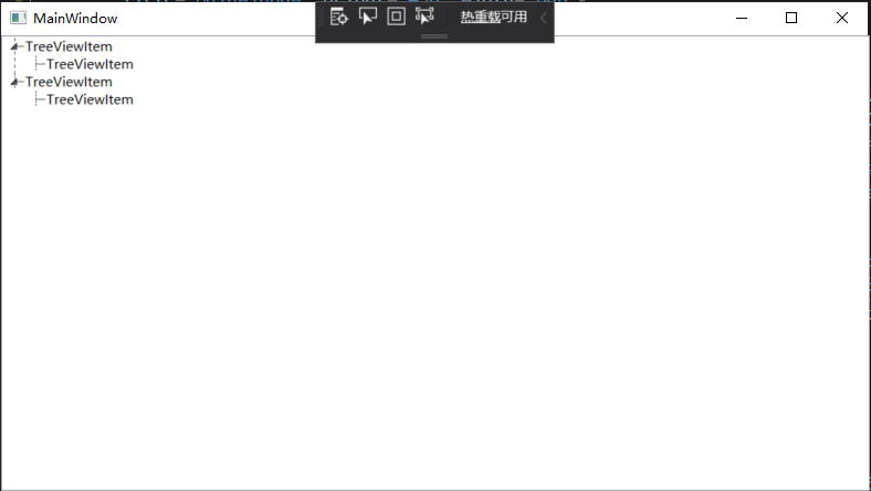
对于当前层最后一个节点,不再画它水平方向线以下的垂直线,这里使用到转换器完成

1
2
3
4
5
6
7
8
9
10
11
12
13
14
class TreeViewLineConverter : IValueConverter
{
public object Convert(object value, Type targetType, object parameter, System.Globalization.CultureInfo culture)
{
var item = value as TreeViewItem;
ItemsControl ic = ItemsControl.ItemsControlFromItemContainer(item);
return ic.ItemContainerGenerator.IndexFromContainer(item) == ic.Items.Count - 1;
}

public object ConvertBack(object value, Type targetType, object parameter, System.Globalization.CultureInfo culture)
{
return false;
}
}

触发器需增加代码

1
2
3
4
5
6
7
8
9
10
<!-- 当前层最后一个元素不画下方垂直线 -->
<DataTrigger Binding="{Binding RelativeSource={RelativeSource Self}, Converter={StaticResource LineConverter}}" Value="true">
<Setter TargetName="VerLn" Property="Height" Value="15"/>
<Setter TargetName="VerLn" Property="VerticalAlignment" Value="Top"/>
</DataTrigger>
<!-- Root第一个元素不显示上方垂直线 -->
<Trigger Property="TabIndex" Value="1">
<Setter TargetName="VerLn" Property="Margin" Value="0,12,1,0"/>
<Setter TargetName="VerLn" Property="Height" Value="Auto"/>
</Trigger>
完整样式代码
1
2
3
4
5
6
7
8
9
10
11
12
13
14
15
16
17
18
19
20
21
22
23
24
25
26
27
28
29
30
31
32
33
34
35
36
37
38
39
40
41
42
43
44
45
46
47
48
49
50
51
52
53
54
55
56
57
58
59
60
61
62
63
64
65
66
67
68
69
70
71
72
73
74
75
76
77
78
79
80
81
82
83
84
85
86
87
88
89
90
91
92
93
94
95
96
97
98
99
100
101
102
103
104
105
106
107
108
109
110
111
112
113
114
115
116
117
118
119
120
121
122
123
124
125
126
127
128
129
130
131
132
133
134
135
136
137
138
139
140
141
142
143
<Style x:Key="TreeViewItemFocusVisual">
<Setter Property="Control.Template">
<Setter.Value>
<ControlTemplate>
<Rectangle/>
</ControlTemplate>
</Setter.Value>
</Setter>
</Style>
<SolidColorBrush x:Key="TreeViewItem.TreeArrow.Static.Checked.Fill" Color="#FF595959"/>
<SolidColorBrush x:Key="TreeViewItem.TreeArrow.Static.Checked.Stroke" Color="#FF262626"/>
<SolidColorBrush x:Key="TreeViewItem.TreeArrow.MouseOver.Stroke" Color="#FF27C7F7"/>
<SolidColorBrush x:Key="TreeViewItem.TreeArrow.MouseOver.Fill" Color="#FFCCEEFB"/>
<SolidColorBrush x:Key="TreeViewItem.TreeArrow.MouseOver.Checked.Stroke" Color="#FF1CC4F7"/>
<SolidColorBrush x:Key="TreeViewItem.TreeArrow.MouseOver.Checked.Fill" Color="#FF82DFFB"/>
<PathGeometry x:Key="TreeArrow" Figures="M0,0 L0,6 L6,0 z"/>
<SolidColorBrush x:Key="TreeViewItem.TreeArrow.Static.Fill" Color="#FFFFFFFF"/>
<SolidColorBrush x:Key="TreeViewItem.TreeArrow.Static.Stroke" Color="#FF818181"/>
<Style x:Key="ExpandCollapseToggleStyle" TargetType="{x:Type ToggleButton}">
<Setter Property="Focusable" Value="False"/>
<Setter Property="Width" Value="16"/>
<Setter Property="Height" Value="16"/>
<Setter Property="Template">
<Setter.Value>
<ControlTemplate TargetType="{x:Type ToggleButton}">
<Border Background="Transparent" Height="16" Padding="5,5,5,5" Width="16">
<Path x:Name="ExpandPath" Data="{StaticResource TreeArrow}" Fill="{StaticResource TreeViewItem.TreeArrow.Static.Fill}" Stroke="{StaticResource TreeViewItem.TreeArrow.Static.Stroke}">
<Path.RenderTransform>
<RotateTransform Angle="135" CenterY="3" CenterX="3"/>
</Path.RenderTransform>
</Path>
</Border>
<ControlTemplate.Triggers>
<Trigger Property="IsChecked" Value="True">
<Setter Property="RenderTransform" TargetName="ExpandPath">
<Setter.Value>
<RotateTransform Angle="180" CenterY="3" CenterX="3"/>
</Setter.Value>
</Setter>
<Setter Property="Fill" TargetName="ExpandPath" Value="{StaticResource TreeViewItem.TreeArrow.Static.Checked.Fill}"/>
<Setter Property="Stroke" TargetName="ExpandPath" Value="{StaticResource TreeViewItem.TreeArrow.Static.Checked.Stroke}"/>
</Trigger>
<Trigger Property="IsMouseOver" Value="True">
<Setter Property="Stroke" TargetName="ExpandPath" Value="{StaticResource TreeViewItem.TreeArrow.MouseOver.Stroke}"/>
<Setter Property="Fill" TargetName="ExpandPath" Value="{StaticResource TreeViewItem.TreeArrow.MouseOver.Fill}"/>
</Trigger>
<MultiTrigger>
<MultiTrigger.Conditions>
<Condition Property="IsMouseOver" Value="True"/>
<Condition Property="IsChecked" Value="True"/>
</MultiTrigger.Conditions>
<Setter Property="Stroke" TargetName="ExpandPath" Value="{StaticResource TreeViewItem.TreeArrow.MouseOver.Checked.Stroke}"/>
<Setter Property="Fill" TargetName="ExpandPath" Value="{StaticResource TreeViewItem.TreeArrow.MouseOver.Checked.Fill}"/>
</MultiTrigger>
</ControlTemplate.Triggers>
</ControlTemplate>
</Setter.Value>
</Setter>
</Style>

<local:TreeViewLineConverter x:Key="LineConverter"/>
<Style TargetType="{x:Type TreeViewItem}">
<Setter Property="Background" Value="Transparent"/>
<Setter Property="HorizontalContentAlignment" Value="{Binding HorizontalContentAlignment, RelativeSource={RelativeSource AncestorType={x:Type ItemsControl}}}"/>
<Setter Property="VerticalContentAlignment" Value="{Binding VerticalContentAlignment, RelativeSource={RelativeSource AncestorType={x:Type ItemsControl}}}"/>
<Setter Property="Padding" Value="1,0,0,0"/>
<Setter Property="Foreground" Value="{DynamicResource {x:Static SystemColors.ControlTextBrushKey}}"/>
<Setter Property="FocusVisualStyle" Value="{StaticResource TreeViewItemFocusVisual}"/>
<Setter Property="Template">
<Setter.Value>
<ControlTemplate TargetType="{x:Type TreeViewItem}">
<Grid>
<Grid.ColumnDefinitions>
<ColumnDefinition MinWidth="19" Width="Auto"/>
<ColumnDefinition Width="Auto"/>
<ColumnDefinition Width="*"/>
</Grid.ColumnDefinitions>
<Grid.RowDefinitions>
<RowDefinition Height="Auto"/>
<RowDefinition/>
</Grid.RowDefinitions>

<!--Connecting Lines-->
<!--Horizontal line-->
<Rectangle x:Name="HorLn" Margin="10,0,0,0" Height="1" Stroke="#FF565656" SnapsToDevicePixels="True" StrokeDashCap="Square" StrokeDashOffset="1"/>
<!--Vertical line-->
<Rectangle x:Name="VerLn" Width="1" Stroke="#FF565656" Margin="0,0,-2,0" Grid.RowSpan="2" SnapsToDevicePixels="true" Fill="White" StrokeDashCap="Square" StrokeDashArray="1,5"/>

<ToggleButton x:Name="Expander" ClickMode="Press" IsChecked="{Binding IsExpanded, RelativeSource={RelativeSource TemplatedParent}}" Style="{StaticResource ExpandCollapseToggleStyle}"/>
<Border x:Name="Bd" BorderBrush="{TemplateBinding BorderBrush}" BorderThickness="{TemplateBinding BorderThickness}" Background="{TemplateBinding Background}" Grid.Column="1" Padding="{TemplateBinding Padding}" SnapsToDevicePixels="true">
<ContentPresenter x:Name="PART_Header" ContentSource="Header" HorizontalAlignment="{TemplateBinding HorizontalContentAlignment}" SnapsToDevicePixels="{TemplateBinding SnapsToDevicePixels}"/>
</Border>
<ItemsPresenter x:Name="ItemsHost" Grid.ColumnSpan="2" Grid.Column="1" Grid.Row="1"/>
</Grid>
<ControlTemplate.Triggers>
<Trigger Property="IsExpanded" Value="false">
<Setter Property="Visibility" TargetName="ItemsHost" Value="Collapsed"/>
</Trigger>
<Trigger Property="HasItems" Value="false">
<Setter Property="Visibility" TargetName="Expander" Value="Hidden"/>
</Trigger>
<Trigger Property="IsSelected" Value="true">
<Setter Property="Background" TargetName="Bd" Value="{DynamicResource {x:Static SystemColors.HighlightBrushKey}}"/>
<Setter Property="Foreground" Value="{DynamicResource {x:Static SystemColors.HighlightTextBrushKey}}"/>
</Trigger>
<MultiTrigger>
<MultiTrigger.Conditions>
<Condition Property="IsSelected" Value="true"/>
<Condition Property="IsSelectionActive" Value="false"/>
</MultiTrigger.Conditions>
<Setter Property="Background" TargetName="Bd" Value="{DynamicResource {x:Static SystemColors.InactiveSelectionHighlightBrushKey}}"/>
<Setter Property="Foreground" Value="{DynamicResource {x:Static SystemColors.InactiveSelectionHighlightTextBrushKey}}"/>
</MultiTrigger>
<Trigger Property="IsEnabled" Value="false">
<Setter Property="Foreground" Value="{DynamicResource {x:Static SystemColors.GrayTextBrushKey}}"/>
</Trigger>

<!-- 当前层最后一个元素不画下方垂直线 -->
<DataTrigger Binding="{Binding RelativeSource={RelativeSource Self}, Converter={StaticResource LineConverter}}" Value="true">
<Setter TargetName="VerLn" Property="Height" Value="15"/>
<Setter TargetName="VerLn" Property="VerticalAlignment" Value="Top"/>
</DataTrigger>
<!-- Root第一个元素不显示上方垂直线 -->
<Trigger Property="TabIndex" Value="1">
<Setter TargetName="VerLn" Property="Margin" Value="0,12,1,0"/>
<Setter TargetName="VerLn" Property="Height" Value="Auto"/>
</Trigger>
</ControlTemplate.Triggers>
</ControlTemplate>
</Setter.Value>
</Setter>
<Style.Triggers>
<Trigger Property="VirtualizingPanel.IsVirtualizing" Value="true">
<Setter Property="ItemsPanel">
<Setter.Value>
<ItemsPanelTemplate>
<VirtualizingStackPanel/>
</ItemsPanelTemplate>
</Setter.Value>
</Setter>
</Trigger>
</Style.Triggers>
</Style>
效果图如下

TreeViewItem显示图片以及名称

1
2
3
4
5
6
7
8
9
10
11
12
13
<TreeView ItemsSource="{Binding Tools}">
<TreeView.Resources>
<local:UriToImageSourceConverter x:Key="UriToImageSource"/>
</TreeView.Resources>
<TreeView.ItemTemplate>
<HierarchicalDataTemplate ItemsSource="{Binding Nodes}">
<DockPanel>
<Image Source="{Binding PicPath, Converter={StaticResource UriToImageSource}}" Width="25" Height="25"/>
<TextBlock Text="{Binding Name}" FontSize="13" VerticalAlignment="Center" Margin="3,0,0,0"/>
</DockPanel>
</HierarchicalDataTemplate>
</TreeView.ItemTemplate>
</TreeView>

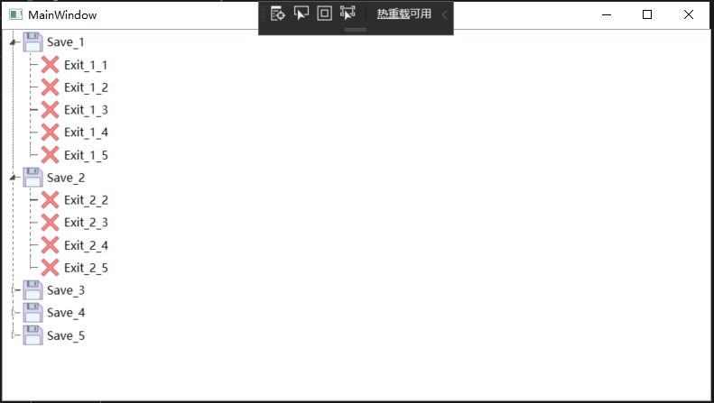
Tools是数据集合,节点集合Nodes。PicPath保存图片名称,使用UriToImageSourceConverter转换器转换成BitmapImage类型显示。

1
2
3
4
5
6
7
8
9
10
11
12
13
14
15
16
17
class UriToImageSourceConverter : IValueConverter
{
public object Convert(object value, Type targetType, object parameter, System.Globalization.CultureInfo culture)
{
string path = (string)value;
if (string.IsNullOrEmpty(path))
{
path = "pack://application:,,,/WpfApp2;component/position.ico";//默认图片
}
return new BitmapImage(new Uri(path, UriKind.Absolute));
}

public object ConvertBack(object value, Type targetType, object parameter, System.Globalization.CultureInfo culture)
{
return false;
}
}
效果图如下

完整代码
1
2
3
4
5
6
7
8
9
10
11
12
13
14
15
16
17
18
19
20
21
22
23
24
25
26
27
28
29
30
31
32
33
34
35
36
37
38
39
40
41
42
43
44
45
46
47
48
49
50
51
52
53
54
55
56
57
58
59
60
61
62
63
64
65
66
67
68
69
70
71
72
73
74
75
76
77
78
79
80
81
82
83
84
85
86
87
88
89
90
91
92
93
94
95
96
97
98
99
100
101
102
103
104
105
106
107
108
109
110
111
112
113
114
115
116
117
118
119
120
121
122
123
124
125
126
127
128
129
130
131
132
133
134
135
136
137
138
139
140
141
142
143
144
145
146
147
148
149
150
151
152
153
154
155
156
157
158
159
160
161
162
163
164
165
166
167
168
169
170
171
172
173
174
<Window x:Class="WpfApp2.MainWindow"
xmlns="http://schemas.microsoft.com/winfx/2006/xaml/presentation"
xmlns:x="http://schemas.microsoft.com/winfx/2006/xaml"
xmlns:d="http://schemas.microsoft.com/expression/blend/2008"
xmlns:mc="http://schemas.openxmlformats.org/markup-compatibility/2006"
xmlns:local="clr-namespace:WpfApp2"
mc:Ignorable="d"
Title="MainWindow" Height="450" Width="800">


<Window.Resources>
<Style x:Key="TreeViewItemFocusVisual">
<Setter Property="Control.Template">
<Setter.Value>
<ControlTemplate>
<Rectangle/>
</ControlTemplate>
</Setter.Value>
</Setter>
</Style>
<SolidColorBrush x:Key="TreeViewItem.TreeArrow.Static.Checked.Fill" Color="#FF595959"/>
<SolidColorBrush x:Key="TreeViewItem.TreeArrow.Static.Checked.Stroke" Color="#FF262626"/>
<SolidColorBrush x:Key="TreeViewItem.TreeArrow.MouseOver.Stroke" Color="#FF27C7F7"/>
<SolidColorBrush x:Key="TreeViewItem.TreeArrow.MouseOver.Fill" Color="#FFCCEEFB"/>
<SolidColorBrush x:Key="TreeViewItem.TreeArrow.MouseOver.Checked.Stroke" Color="#FF1CC4F7"/>
<SolidColorBrush x:Key="TreeViewItem.TreeArrow.MouseOver.Checked.Fill" Color="#FF82DFFB"/>
<PathGeometry x:Key="TreeArrow" Figures="M0,0 L0,6 L6,0 z"/>
<SolidColorBrush x:Key="TreeViewItem.TreeArrow.Static.Fill" Color="#FFFFFFFF"/>
<SolidColorBrush x:Key="TreeViewItem.TreeArrow.Static.Stroke" Color="#FF818181"/>
<Style x:Key="ExpandCollapseToggleStyle" TargetType="{x:Type ToggleButton}">
<Setter Property="Focusable" Value="False"/>
<Setter Property="Width" Value="16"/>
<Setter Property="Height" Value="16"/>
<Setter Property="Template">
<Setter.Value>
<ControlTemplate TargetType="{x:Type ToggleButton}">
<Border Background="Transparent" Height="16" Padding="5,5,5,5" Width="16">
<Path x:Name="ExpandPath" Data="{StaticResource TreeArrow}" Fill="{StaticResource TreeViewItem.TreeArrow.Static.Fill}" Stroke="{StaticResource TreeViewItem.TreeArrow.Static.Stroke}">
<Path.RenderTransform>
<RotateTransform Angle="135" CenterY="3" CenterX="3"/>
</Path.RenderTransform>
</Path>
</Border>
<ControlTemplate.Triggers>
<Trigger Property="IsChecked" Value="True">
<Setter Property="RenderTransform" TargetName="ExpandPath">
<Setter.Value>
<RotateTransform Angle="180" CenterY="3" CenterX="3"/>
</Setter.Value>
</Setter>
<Setter Property="Fill" TargetName="ExpandPath" Value="{StaticResource TreeViewItem.TreeArrow.Static.Checked.Fill}"/>
<Setter Property="Stroke" TargetName="ExpandPath" Value="{StaticResource TreeViewItem.TreeArrow.Static.Checked.Stroke}"/>
</Trigger>
<Trigger Property="IsMouseOver" Value="True">
<Setter Property="Stroke" TargetName="ExpandPath" Value="{StaticResource TreeViewItem.TreeArrow.MouseOver.Stroke}"/>
<Setter Property="Fill" TargetName="ExpandPath" Value="{StaticResource TreeViewItem.TreeArrow.MouseOver.Fill}"/>
</Trigger>
<MultiTrigger>
<MultiTrigger.Conditions>
<Condition Property="IsMouseOver" Value="True"/>
<Condition Property="IsChecked" Value="True"/>
</MultiTrigger.Conditions>
<Setter Property="Stroke" TargetName="ExpandPath" Value="{StaticResource TreeViewItem.TreeArrow.MouseOver.Checked.Stroke}"/>
<Setter Property="Fill" TargetName="ExpandPath" Value="{StaticResource TreeViewItem.TreeArrow.MouseOver.Checked.Fill}"/>
</MultiTrigger>
</ControlTemplate.Triggers>
</ControlTemplate>
</Setter.Value>
</Setter>
</Style>

<local:TreeViewLineConverter x:Key="LineConverter"/>
<Style TargetType="{x:Type TreeViewItem}">
<Setter Property="Background" Value="Transparent"/>
<Setter Property="HorizontalContentAlignment" Value="{Binding HorizontalContentAlignment, RelativeSource={RelativeSource AncestorType={x:Type ItemsControl}}}"/>
<Setter Property="VerticalContentAlignment" Value="{Binding VerticalContentAlignment, RelativeSource={RelativeSource AncestorType={x:Type ItemsControl}}}"/>
<Setter Property="Padding" Value="1,0,0,0"/>
<Setter Property="Foreground" Value="{DynamicResource {x:Static SystemColors.ControlTextBrushKey}}"/>
<Setter Property="FocusVisualStyle" Value="{StaticResource TreeViewItemFocusVisual}"/>
<Setter Property="Template">
<Setter.Value>
<ControlTemplate TargetType="{x:Type TreeViewItem}">
<Grid>
<Grid.ColumnDefinitions>
<ColumnDefinition MinWidth="19" Width="Auto"/>
<ColumnDefinition Width="Auto"/>
<ColumnDefinition Width="*"/>
</Grid.ColumnDefinitions>
<Grid.RowDefinitions>
<RowDefinition Height="Auto"/>
<RowDefinition/>
</Grid.RowDefinitions>

<!--Connecting Lines-->
<!--Horizontal line-->
<Rectangle x:Name="HorLn" Margin="10,0,0,0" Height="1" Stroke="#FF565656" SnapsToDevicePixels="True" StrokeDashCap="Square" StrokeDashOffset="1"/>
<!--Vertical line-->
<Rectangle x:Name="VerLn" Width="1" Stroke="#FF565656" Margin="0,0,-2,0" Grid.RowSpan="2" SnapsToDevicePixels="true" Fill="White" StrokeDashCap="Square" StrokeDashArray="1,5"/>

<ToggleButton x:Name="Expander" ClickMode="Press" IsChecked="{Binding IsExpanded, RelativeSource={RelativeSource TemplatedParent}}" Style="{StaticResource ExpandCollapseToggleStyle}"/>
<Border x:Name="Bd" BorderBrush="{TemplateBinding BorderBrush}" BorderThickness="{TemplateBinding BorderThickness}" Background="{TemplateBinding Background}" Grid.Column="1" Padding="{TemplateBinding Padding}" SnapsToDevicePixels="true">
<ContentPresenter x:Name="PART_Header" ContentSource="Header" HorizontalAlignment="{TemplateBinding HorizontalContentAlignment}" SnapsToDevicePixels="{TemplateBinding SnapsToDevicePixels}"/>
</Border>
<ItemsPresenter x:Name="ItemsHost" Grid.ColumnSpan="2" Grid.Column="1" Grid.Row="1"/>
</Grid>
<ControlTemplate.Triggers>
<Trigger Property="IsExpanded" Value="false">
<Setter Property="Visibility" TargetName="ItemsHost" Value="Collapsed"/>
</Trigger>
<Trigger Property="HasItems" Value="false">
<Setter Property="Visibility" TargetName="Expander" Value="Hidden"/>
</Trigger>
<Trigger Property="IsSelected" Value="true">
<Setter Property="Background" TargetName="Bd" Value="{DynamicResource {x:Static SystemColors.HighlightBrushKey}}"/>
<Setter Property="Foreground" Value="{DynamicResource {x:Static SystemColors.HighlightTextBrushKey}}"/>
</Trigger>
<MultiTrigger>
<MultiTrigger.Conditions>
<Condition Property="IsSelected" Value="true"/>
<Condition Property="IsSelectionActive" Value="false"/>
</MultiTrigger.Conditions>
<Setter Property="Background" TargetName="Bd" Value="{DynamicResource {x:Static SystemColors.InactiveSelectionHighlightBrushKey}}"/>
<Setter Property="Foreground" Value="{DynamicResource {x:Static SystemColors.InactiveSelectionHighlightTextBrushKey}}"/>
</MultiTrigger>
<Trigger Property="IsEnabled" Value="false">
<Setter Property="Foreground" Value="{DynamicResource {x:Static SystemColors.GrayTextBrushKey}}"/>
</Trigger>

<!-- 当前层最后一个元素不画下方垂直线 -->
<DataTrigger Binding="{Binding RelativeSource={RelativeSource Self}, Converter={StaticResource LineConverter}}" Value="true">
<Setter TargetName="VerLn" Property="Height" Value="15"/>
<Setter TargetName="VerLn" Property="VerticalAlignment" Value="Top"/>
</DataTrigger>
<!-- Root第一个元素不显示上方垂直线 -->
<Trigger Property="TabIndex" Value="1">
<Setter TargetName="VerLn" Property="Margin" Value="0,12,1,0"/>
<Setter TargetName="VerLn" Property="Height" Value="Auto"/>
</Trigger>
</ControlTemplate.Triggers>
</ControlTemplate>
</Setter.Value>
</Setter>
<Style.Triggers>
<Trigger Property="VirtualizingPanel.IsVirtualizing" Value="true">
<Setter Property="ItemsPanel">
<Setter.Value>
<ItemsPanelTemplate>
<VirtualizingStackPanel/>
</ItemsPanelTemplate>
</Setter.Value>
</Setter>
</Trigger>
</Style.Triggers>
</Style>
</Window.Resources>


<Grid>
<TreeView x:Name="tree" ItemsSource="{Binding Tools}">
<TreeView.Resources>
<local:UriToImageSourceConverter x:Key="UriToImageSource"/>
</TreeView.Resources>
<TreeView.ItemTemplate>
<HierarchicalDataTemplate ItemsSource="{Binding Nodes}">
<DockPanel>
<Image Source="{Binding PicPath, Converter={StaticResource UriToImageSource}}" Width="25" Height="25"/>
<TextBlock Text="{Binding Name}" FontSize="13" VerticalAlignment="Center" Margin="3,0,0,0"/>
</DockPanel>
</HierarchicalDataTemplate>
</TreeView.ItemTemplate>
</TreeView>
</Grid>
</Window>

1
2
3
4
5
6
7
8
9
10
11
12
13
14
15
16
17
18
19
20
21
22
23
24
25
26
27
28
29
30
31
32
33
34
35
36
37
38
39
40
41
42
43
44
45
46
47
48
49
50
51
52
53
54
55
56
57
58
59
60
61
62
63
64
65
66
67
68
69
70
71
72
73
74
75
76
77
78
79
80
81
82
83
84
85
86
87
88
89
90
91
92
93
94
95
96
97
98
99
100
101
102
103
104
105
106
107
108
109
110
111
112
using System;
using System.Collections.Generic;
using System.Linq;
using System.Text;
using System.Threading.Tasks;
using System.Windows;
using System.Windows.Controls;
using System.Windows.Data;
using System.Windows.Documents;
using System.Windows.Input;
using System.Windows.Media;
using System.Windows.Media.Imaging;
using System.Windows.Navigation;
using System.Windows.Shapes;

namespace WpfApp2
{
/// <summary>
/// MainWindow.xaml 的交互逻辑
/// </summary>
public partial class MainWindow : Window
{
public MainWindow()
{
InitializeComponent();


Tools = new List<NodeX>();

for (int i = 0; i < 5; i++)
{
Tools.Add(new NodeX()
{
Name = $"Save_{i + 1}",
PicPath = "pack://application:,,,/WpfApp2;component/Save.png",
});

for (int j = i; j < 5; j++)
{
if (Tools[i].Nodes == null)
{
Tools[i].Nodes = new List<NodeX>();
}
Tools[i].Nodes.Add(new NodeX()
{
Name = $"Exit_{i + 1}_{j + 1}",
PicPath = "pack://application:,,,/WpfApp2;component/Exit.png",
});
}
}

tree.ItemsSource = Tools;
}


public List<NodeX> Tools { get; set; }

}

class TreeViewLineConverter : IValueConverter
{
public object Convert(object value, Type targetType, object parameter, System.Globalization.CultureInfo culture)
{
var item = value as TreeViewItem;
ItemsControl ic = ItemsControl.ItemsControlFromItemContainer(item);
return ic.ItemContainerGenerator.IndexFromContainer(item) == ic.Items.Count - 1;
}

public object ConvertBack(object value, Type targetType, object parameter, System.Globalization.CultureInfo culture)
{
return false;
}
}

class UriToImageSourceConverter : IValueConverter
{
public object Convert(object value, Type targetType, object parameter, System.Globalization.CultureInfo culture)
{
string path = (string)value;
if (string.IsNullOrEmpty(path))
{
path = "pack://application:,,,/WpfApp2;component/position.ico";
}
return new BitmapImage(new Uri(path, UriKind.Absolute));
}

public object ConvertBack(object value, Type targetType, object parameter, System.Globalization.CultureInfo culture)
{
return false;
}
}


public class NodeX
{

#region Property

/// <summary>显示内容</summary>
public string Name { get; set; }

/// <summary>显示图片路径</summary>
public string PicPath { get; set; }

/// <summary>子节点,默认null</summary>
public IList<NodeX> Nodes { get; set; }

#endregion

}

}

Blend修改TreeViewItem样式
https://njit-77.github.io/2020/02/13/Blend修改TreeViewItem样式/
作者
njit-77
发布于
2020年2月13日
许可协议